- 100
- 99
- 98
- 97
- 96
- 95
- 94
- 93
- 92
- 91
- 90
- 89
- 88
- 87
- 86
- 85
- 84
- 83
- 82
- 81
- 80
- 79
- 78
- 77
- 76
- 75
- 74
- 73
- 72
- 71
- 70
- 69
- 68
- 67
- 66
- 65
- 64
- 63
- 62
- 61
- 60
- 59
- 58
- 57
- 56
- 55
- 54
- 53
- 52
- 51
- 50
- 49
- 48
- 47
- 46
- 45
- 44
- 43
- 42
- 41
- 40
- 39
- 38
- 37
- 36
- 35
- 34
- 33
- 32
- 31
- 30
- 29
- 28
- 27
- 26
- 25
- 24
- 23
- 22
- 21
- 20
- 19
- 18
- 17
- 16
- 15
- 14
- 13
- 12
- 11
- 10
- 09
- 08
- 07
- 06
- 05
- 04
- 03
- 02
- 01
- 00
Creative Dev
Next.js
GSAP
WebGL
Awwwards
The FWA
CSSDA
Creative Dev
Next.js
GSAP
WebGL
Showcase of the works of Los Angeles-based cinematographer
Design: CUSP
View live: eringwesley.com
Portfolio site with several types of galleries for a Los Angeles-based cinematographer Erin G. Wesley.
Erin G. Wesley: standout portfolio website with easter eggs for a cinematographer
Erin G. Wesley is a Los Angeles-based cinematographer. Her portfolio includes works for projects for Netflix, Nike, NBA and Snoop Dogg. She’s also an accomplished photographer and regularly travels the world in search of new visual inspiration. She needed a portfolio site — something she could leverage to help find that next great production project.
We used the React framework Next.js to build the website. To create interactive experiences and key visual features, we used GSAP, WebGL shaders and PixiJS. At the heart of the site — our own custom scroll, which we call amayzing SNP scroll. It helps to improve website performance.
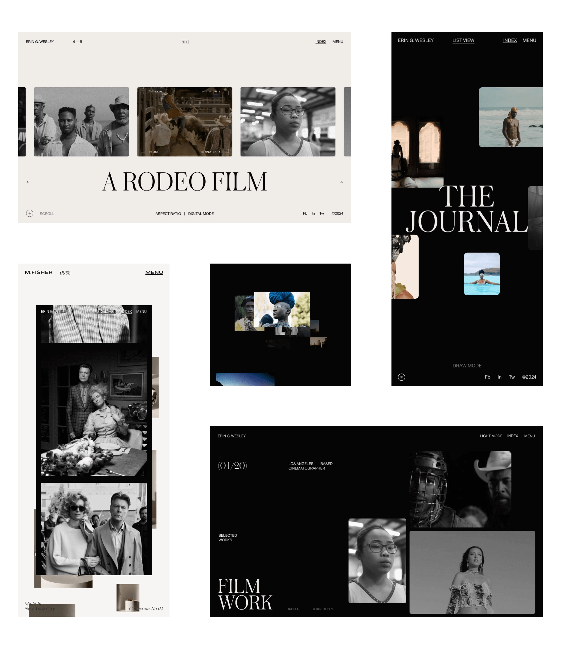
The focus for the entire experience is Erin’s incredible videography catalog. The main gallery creates a fluid and easy to navigate structure — built for speed so the user can cycle through multiple projects in a quick, dynamic fashion. There are so many easter eggs and little experiences within this seemingly simple portfolio site — but you have to dig around to find them.
The most unique element on the site is Z-Space gallery, which allows to zoom into Erin’s creative catalog in an unexpected way. It’s a visually interesting way to view all of Erin’s work in one place, and is just a lot of fun to play around with. The gallery reacts to cursor position, and can be scrolled forward and backwards through ‘time’ offering a unique glimpse into the mind of Erin Wesley.
From the technical perspective, the most challenging part was the video gallery on the Home page. To make this gallery work seamless, we needed to combine several technologies at once. We connected our aSNP scroll and DOM elements with Pixi.js and added shaders. The focus of the work was really on revising and optimizing the experience working with videos. We had to make them load quickly and play smoothly on any device, anywhere.
Erin reaches a global audience with her professional work, so we had to plan for a wide variety of devices, connections and experiences. Besides on the Home page there is a small detail we’re really proud of — the aspect ratio change for the homepage thumbnails. It’s a subtle element to make the homepage view feel slightly cinematic in a way, and we thought it was a lot of fun.


Erin needed an ability to manage all the new content she was generating. For content management we used Strapi, which was completely customizable and allowed us to build it specifically for Erin’s day-to-day site management needs. Because of Strapi's minimalistic interface it is easy to interact and work with content rather than navigate the dashboard.
AWARDS
AWWWARDS
- Site of the Day
- Developer Award
The FWA
- FWA of the Day
CSS DESIGN AWARDS
- Website of the Day